Flaxby / TheraPur (Dreams)
Brand identity
Problem:
With new modern competitor products flooding the market the look and feel of some of the Dreams branded products were in need of a refresh, they were looking old and didn't reflect the innovative and unique selling points of the product.
Solution:
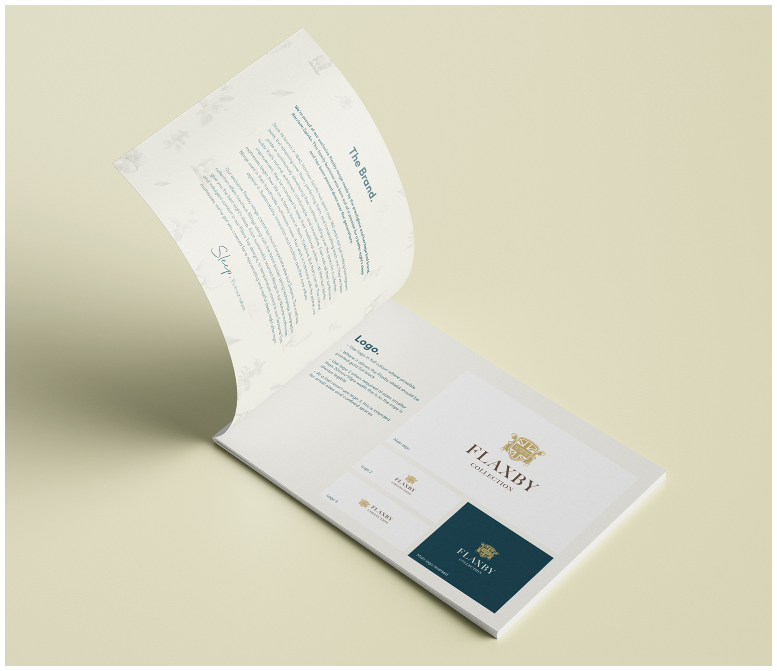
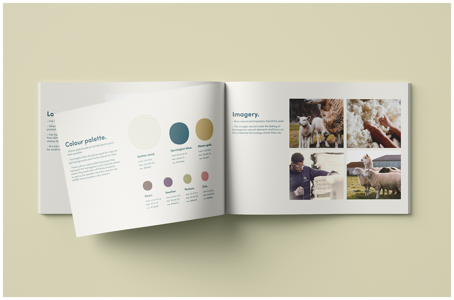
Flaxby, an all-natural mattress range with fillings from sustainable sources, most of which is grown on a farm in Yorkshire. These products are some of the most premium, supportive and clever mattresses available on the market with such innovations like 16500 glueless micro pocket springs. By using raw photography, line drawings/blueprints of the fillings and a natural palette I was able to strengthen the link to the farm and the extensive family owned heritage whilst modernising the style of design by keeping it simple.
Solution:
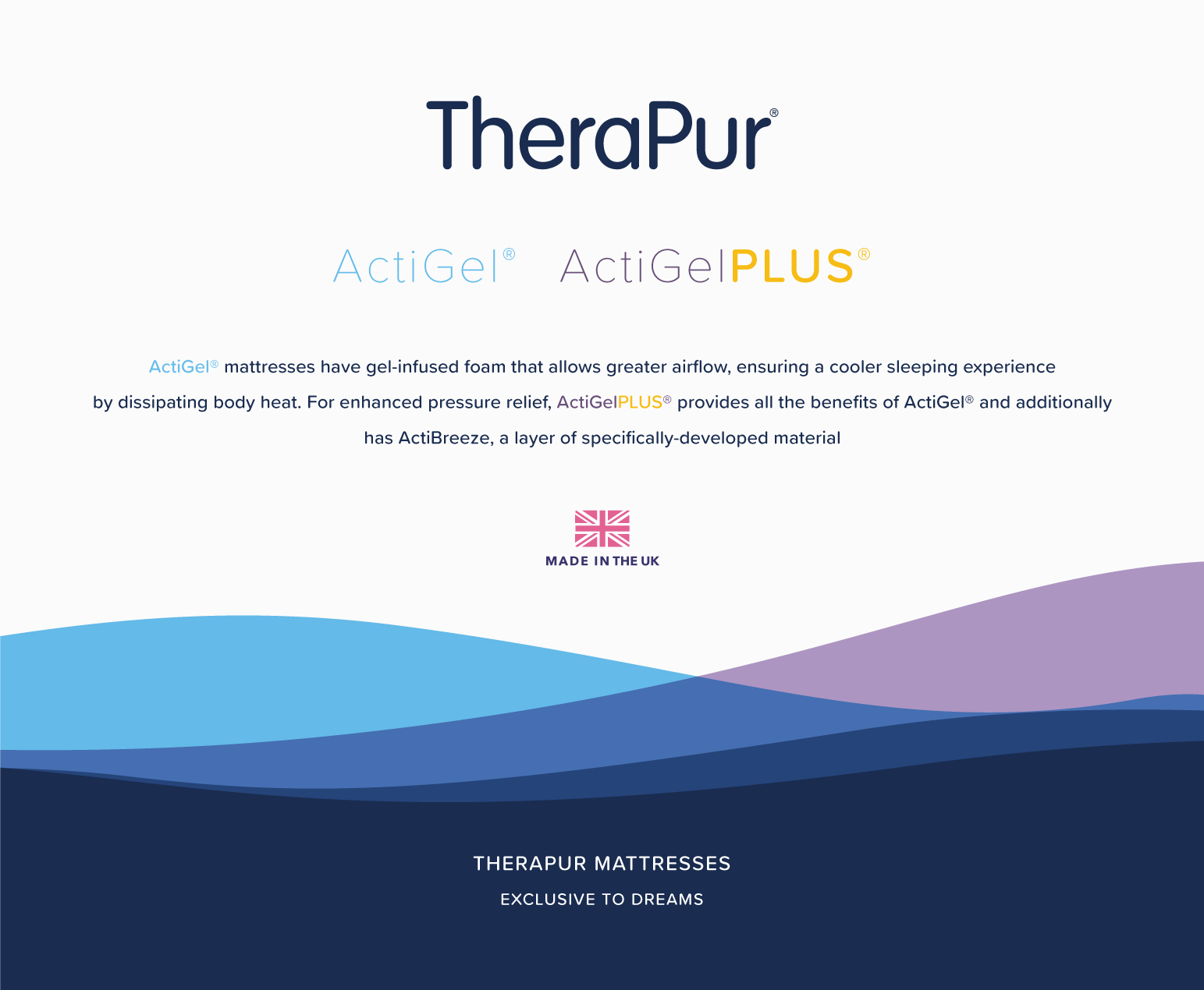
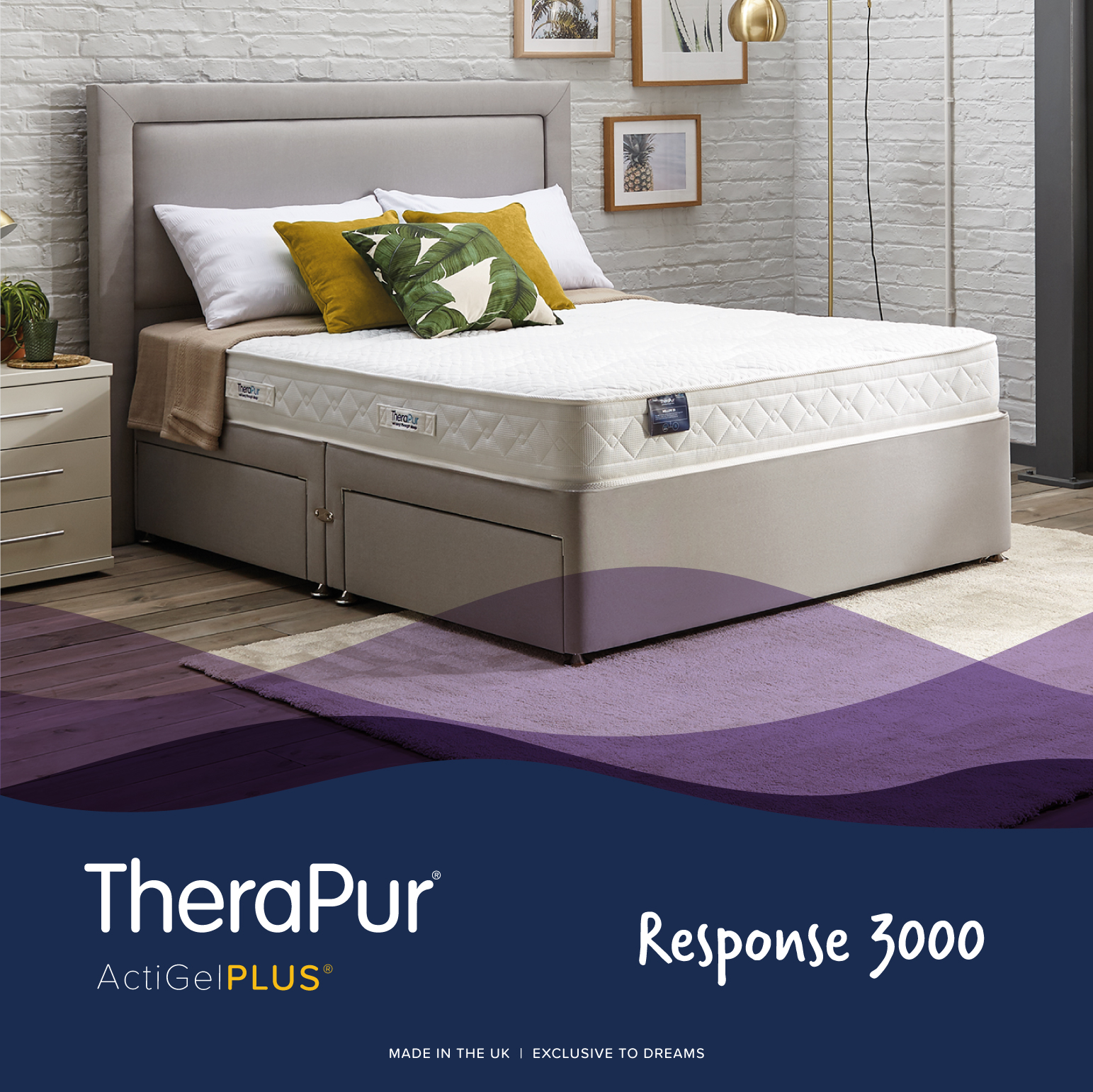
Therapur, "products that rival the best". Airflow is essential for a good night sleep and to ensure the longevity of your mattress. This message is at the core of the brand and by using the airflow wave graphics I have enforced this as well as the fluidity of the gel infused foam. a palette of fresh bright accent colours were used within the brand to allow stand out against the brand blue.